Accessibility Standards Technical Guide For Moodle
Use this checklist below to review your course for accessibility. For each topic, review the need for meeting the standard, how to meet the standard in your course, along with an example of what a correction looks like.
Topics
1. Abbreviations/Acronyms & Misspellings
Need: Full definition of abbreviation/acronym
How to: Look the course pages and handouts and anytime an abbreviation or acronym is found, add the full name by editing the page in Moodle or within the shared document.
Example:
NASA = National Aeronautics and Space Administration
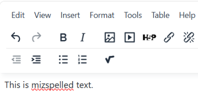
Need: Fix mispelled words like this one!
How to: When you are editing text in Moodle, the text area’s toolbar (HTML editor) has a built-in spell checker. Check for red squiggly lines and fix any misspellings. You may right-click on the word to see a suggested spelling or retype the word to correct the spelling.
2. Audio or Video Created/Hosted by Clarkson University's Echo360
Need: Plain-text transcript or description of all audio or video files created and/or hosted by Clarkson University instructor (file is embedded or linked from Echo360). (If presentations are created with recorded audio, a script used to record the audio may be acceptable.)
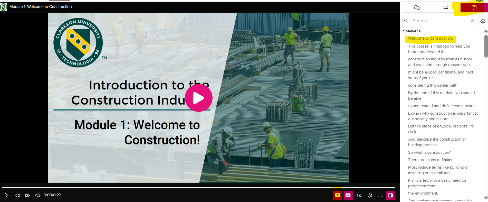
How to: review how to turn on automatic transcribing (and closed captioning) Echo360: Automatic Speech Recognition or ASR Students who view/listen to the video or audio recording will also have the option to read the transcript.
Example:
3. Charts, Diagrams & Infographics
Need: All charts and diagrams need descriptions. Academic/content knowledge is needed to accurately describe some images, charts and diagrams.
How to: Identify the Key Message-Message- before writing, summarize the image in one sentence. If you cannot identify the main point, students may struggle as well. Describe the information, not the appearance and avoid describing colors, shapes, or layout unless they are important to understanding the content.
Examples
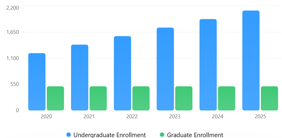
- A graph showing enrollment trends → Describe the trend and key data points.
Enrollment Trends (2020–2025)Undergraduate enrollment increased substantially while graduate enrollment remained stable.

- A process diagram → Describe the steps and relationships.
- "This graph shows online enrollment increasing over five years."
- "This diagram explains the water cycle."
- "This chart compares operating expenses across departments."
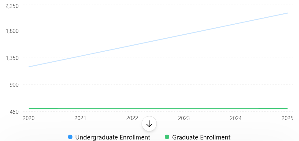
3. RatherTo describe the graph below, rather than "Blue bars are taller than the redgreen bars." use "Undergraduate enrollment increased from 1,200 students in 2020 to 2,100 students in 2025, while graduate enrollment remained stable."
4. Include Important Data or Relationships.Relationships. Explain:
- Trends
- Patterns
- Comparisons
- Cause-and-effect relationships
- Key values when relevant
Example:
- Instead of: "Line graph showing sales over time."
- Use: "Line graph showing quarterly sales increasing steadily from $50,000 in Q1 to $120,000 in Q4."
5. Match the Description Length to the Complexity
Example: Enrollment trend graph. Detailed description follows.
Long description: "The graph shows total enrollment increasing from 3,200 students in 2020 to 4,700 students in 2025, with the largest growth occurring between 2023 and 2024."
Special Tips for Common Teaching Materials:
Charts and Graphs
Describe:
- What is being measured
- Main trend
- Significant comparisons
- Important values
Example: "Bar chart comparing course completion rates. Online courses show an 85% completion rate, hybrid courses 88%, and face-to-face courses 91%.
Diagrams and Models
Describe:
- Components
- Relationships
- Sequence or flow
Example:
"The diagram illustrates the marketing process: identify customer needs, develop products, promote offerings, and evaluate results."
Infographics
Describe:
- Main purpose
- Key statistics
- Important takeaways
- Do not attempt to describe every visual element.
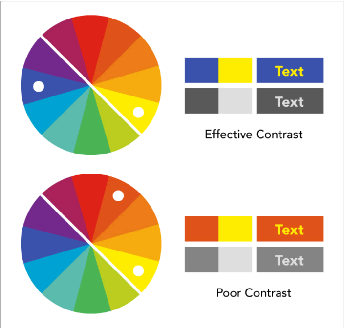
4. Color Schemes for Files (Presentations, Media, Text, etc.)
Need: Use high-contrast colors together, especially with text (light on dark, dark on light). Avoid using red for text and background images/patterns behind text. Only solid colored backgrounds should be used for text.
How to: Choose colors that are opposites on the color-wheel.
Examples
Example 1: High vs low visibility

Example 2: Contrasting colors on the wheel
Example 3: Make sure that colors are not the only method of conveying important information.
This image below shows a portion of the New York City public transportation system, where the routes are distinguished by the color of the lines.
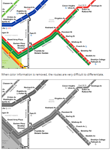 Color enhances the user experience. However, when colors are not perceived by users who are blind or color-blind, are overridden by custom settings, or are not readily distinguishable, this information would need to be conveyed by annotating the image, using different styles or contrasts for each line, or by supplementing the image with text on the web page that conveys the same information. Courtesy of WebAim's Color Contrast Checker
5. Data Tables
Need: Since data tables help organize information, but students using screen readers may not be able to quickly identify the purpose or significance of the data without additional context. All data tables must have a title (identifies what the table contains) and a text description (explains the important information, trends, or conclusions students should understand from the data) of the data in the table that is being shown.
How to: To make data tables accessible, provide:
- A clear table title
- Proper row and column headers
- A brief text description that explains the information shown in the table
Examples
1. Give the Table a Meaningful TitleThe title should clearly identify the content of the table.
Examples:Example:
- Table 1. Student Enrollment by Year
- Table 2. Average Exam Scores by Course Section
- Table 3. Quarterly Sales Revenue for 2025
Avoid Table, Data, Results as these titles do not provide enough information about the table's contents.
Step 2: Use Clear Row and Column Headers
Headers help screen reader users understand the relationship between data cells.
Example
YearEnrollment20221,25020231,42020241,680
The first row should be designated as header cells whenever possible.
Step 3: Add a Text Description
A text description explains the key information or trends shown in the table. Ask yourself:"What should students learn from this table?" The answer becomes your description.
Example 1: Simple Data Table
Table Title
Table 1. Student Enrollment by Year
YearEnrollment20221,25020231,42020241,680
Description
"Student enrollment increased each year between 2022 and 2024, growing from 1,250 students to 1,680 students overall."
Example 2: Comparison Table
Table Title
Table 2. Course Completion Rates by Delivery Method
Delivery MethodCompletion RateOnline85%Hybrid88%Face-to-Face91%
Description
"Face-to-face course"Face-to-face courses had the highest completion rate at 91%, followed by hybrid courses at 88% and online courses at 85%."Example 3: Large or Complex Tables had the highest completion rate at 91%, followed by hybrid courses at 88% and online courses at 85%."
Example 3: Large or Complex Table
For larger tables, summarize the most important findings rather than repeating every value.
Description "The table shows quarterly sales across four regions. The West region generated the highest annual revenue, while all regions experienced increased sales during the fourth quarter."
Focus on: |
Avoid: |
| ✔ Major trends ✔ Significant comparisons ✔ Highest and lowest values ✔ Patterns students should notice ✔ Conclusions relevant to the course content |
✘ Reading every cell value ✘ Repeating information already obvious from the title ✘ Describing table formatting, colors, or layout |
Tip: The goal is not to describe every number in the table. The goal is to explain the information students should learn from the data. A student who cannot see the table should still understand its purpose and key findings from the accompanying description.
6. Hyperlinks/URLs
Need: Descriptive title for links (i.e. name of website, title of article, title/description of file)
How to: Fixing broken links improves usability for all users. Prior to the start of courses 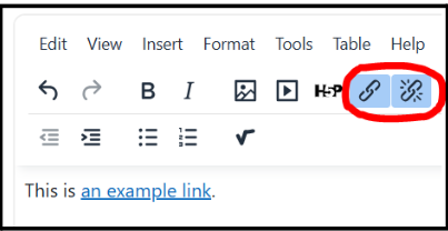
click through each of the links in your course, especially those that link to external websites, to be sure they are working correctly. If you find any broken links, fix them by clicking on the chain link icon in your toolbar. If the link is not fixable, remove the link by clicking on the broken chain icon in your toolbar, or by deleting the text.To create a new link or to see how to add descriptive text, see step-by-step instructions in the article Create an Active Hyperlink
Example:
7. Images
Need: All images must have descriptions if the image is relevant to the learning material. Screen readers will read the description of any image in the page.
How to: When adding an image, fill in any information about the image when prompted, giving the image a descriptive name or describing the image in more depth if necessary. When creating alternative text (alt text) or image descriptions, focus on the information students need to understand the content—not every visual detaildetail.
- Determine why the Image Is Included. Ask yourself: "If I removed this image, what information would students miss?"
- To edit an image already in the
course,course, click on the image to select it, click on the image tool (or right click on the image and choose edit image from the drop down menu. Add the complete description, or if the image is not important to the content of the course add double quotes "" in the description area. Screen readers will skip any image with double quotes.
Examples:
 A decorative image → No description needed (mark as decorative if possible "").
- A photo of a laboratory setup → Describe the equipment and arrangement.

- Use brief alt text.
- Image: laboratory setup
- Alt text: Basic equipment needed for experiments

Special Tips for Common Teaching Materials-Materials
Photographs
Nursing student practicing blood pressure measurement on a patient in a clinical skills lab.
Describe:
- People
- Actions
- Relevant objects
- Context
Example:

Before finalizing your description, ask:
☐ What is the instructional purpose of this image?
☐ Have I described the important information?
☐ Would a student understand the image without seeing it?
8. Mathematical Equations & Symbols
Need: Names of symbols or definition of equation. Also use Live Text (not Images): never upload screenshots or images of math equations.
How to: There are several ways to accomplish accessible math equations and symbols but unless you want to write code manually, use Moodle's Graphical Equation Editor which is built-in to either the TinyMCE or Atto text editor to automatically convert input into accessible MathJax.
- Open any text area in Moodle (e.g., a Page, Assignment, or Quiz).
- Expand the toolbar and click the Equation Editor (a calculator icon).
- Use the tabs to select operators, arrows, and Greek symbols visually, or type your TeX directly into the provided field.
- The editor provides an instant preview so you can see how it will display before saving
Equation Editor Example:
- Type a number for your equation into the text box below the operator options.
- Click the button of the operator you want to use.
- Now complete your equation by adding another number and any additional operators you would like.
- You can see a preview of what the students will see before you save by looking at the equation Preview below the text box!
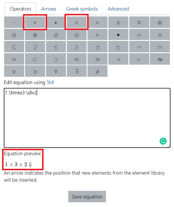
- You can see a preview of what the students will see before you save by looking at the equation Preview below the text box!
- Once ready click Save Equation to add it officially to your text area.
Simple Example:
- Equation: a2 + b2 = c2
- Definition: a squared plus b squared equals c squared
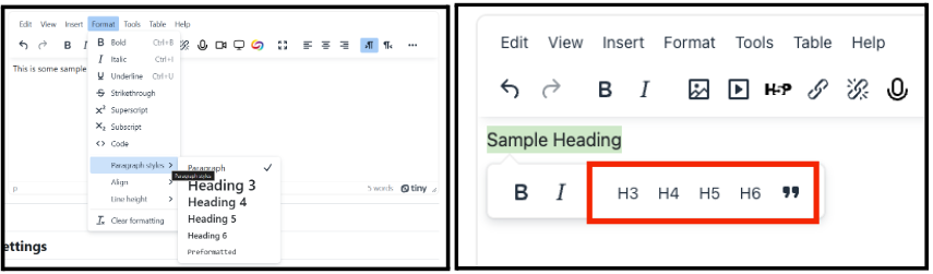
9. Text Formatting
Need: Screen readers automatically detect heading styles for document navigation and structure.Compliant heading styles can be set to a specific font, size, and boldness. Changing text sizes, fonts, and appearance (italic, bold, colored, etc.) does not correctly format text.
How to: Use the built in heading styles available in Moodle text editors.
The text editors look slightly different depending upon if you are using the Atto (Default) or TinyMCE editor.
Example: Moodle Heading Text
10. PDFs (Portable Document Formats)
Need: PDFs must be text-based, not scanned. If scanning is the only option, they must be scanned using an Optical Character Recognition (OCR) and reviewed for accuracy. Publishers of articles can be contacted to request text-based electronic copies.
How to: If you have a scanned PDF file, use Google Gemini , and request it to turn the scan into text. Gemini is included with your Clarkson Google Workplace for Education plan. Also TLC Staff will be glad to help you turn your scanned PDFs into text-based PDFs.
Checklist for an Accessible PDF
-
-
- Text can be selected, searched, or copied
- Logical reading order including article title, author, body text (left column right column and section headings
- High contrast and readable typography
- Columns are structured correctly
- Highlighting does not block access
-
Examples
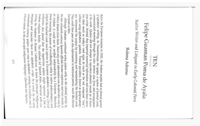
Example 1: Not Accessible Bowed Image from Copier Machine
When a document is copied on a copy machine that bows or curves the page, the text along those curved lines becomes distorted. Reading software interprets that distortion as missing content, so any words in the bowed areas may be skipped entirely.
Example 2 : Not Accessible Side Ways PDF
When a book is copied sideways, the scanned pages are not accessible. Reading software cannot correctly detect orientation, causing text to be misread or skipped.
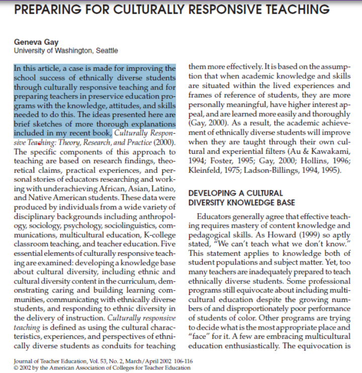
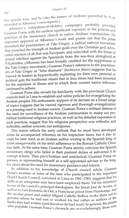
 Example 3: Accessible PDF
This PDF is accessible because it contains real, selectable text with a logical reading order, proper document structure, and sufficient color contrast, allowing screen readers and other assistive technologies to interpret the content accurately.